Create Your First Project
Start adding your projects to your portfolio. Click on "Manage Projects" to get started
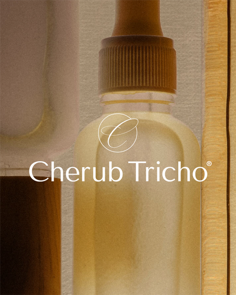
Cherub Tricho
Brand Strategy, Logo Design, Brand Identity, Social Media Design, Signage Design & Art Direction
Cherub Tricho, a premier Canary Wharf, London-based trichology clinic, partnered with Atin to undertake a complete visual evolution, moving beyond traditional clinical aesthetics to establish a definitive "Minimalist Physician" persona. Our strategic brief focused on balancing scientific structural integrity with a restorative, sanctuary-like soul, creating a cohesive visual world that could anchor their new flagship location and scale their digital footprint globally.
The resulting design system is rooted in the philosophy of "Science meets Spirit," led by a meticulous refinement of the brand’s architectural wordmark constructed on a precise 8X grid to ensure clinical authority across every touchpoint. We developed a multi-tiered logo suite - comprising primary, secondary, and tertiary lockups - optimised for everything from large-scale architectural signage to mobile-first social assets. This was complemented by the Sanctuary colour palette, featuring a sophisticated mix of Tricho Olive, Cherub Charcoal, and Sanctuary Cream that reflects the brand’s apothecary heritage. To humanise the clinical experience, our art direction paired technical macro-photography with warm, emotive connection, successfully reinforcing the brand's restorative promise.
The culmination of this collaboration is a definitive 68-page Global Brand Guideline, providing a robust framework that defines typographic hierarchy - utilising Canela and Inter - alongside detailed 3D environmental mockups for their Canary Wharf, London storefront. This unified, market-ready identity has successfully repositioned Cherub Tricho as a premium clinical authority, ensuring their "minimalist physician" aesthetic is communicated powerfully across the competitive London wellness market.


