Health & Wellness Branding: The Cherub Tricho London Case Study
Updated: Sep 4

The Commercial Challenge: Repositioning a London Wellness Clinic
Cherub Tricho required a complete visual evolution to move beyond traditional, sterile medical aesthetics. To succeed in the competitive London market, the objective was to establish a definitive "Minimalist Physician" persona that balanced scientific structural integrity with a restorative, sanctuary-like soul. This strategic positioning was required to anchor their new flagship location, elevate their wellness practitioner branding, and scale their digital footprint globally.

Strategic Brand Architecture & Grid Systems
True wellness brand identity design relies on mathematical precision. The resulting design system is rooted in a meticulous refinement of the brand's architectural wordmark, constructed on a precise 8X grid to project absolute clinical authority across every touchpoint. We developed a multi-tiered logo suite — comprising primary, secondary, and tertiary lockups — optimised for everything from architectural signage to mobile-first social assets. The typographic hierarchy utilises Canela and Inter to bridge the gap between medical expertise and luxury wellness studio branding.

The 'Sanctuary' Palette & Visual Guidelines
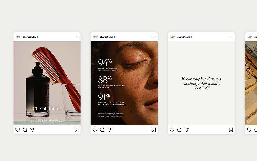
To differentiate from standard medical clinics that rely on generic healthcare blues, we engineered the Sanctuary colour palette for holistic wellness branding. Featuring a sophisticated mix of Tricho Olive, Cherub Charcoal, and Sanctuary Cream, this formulation directly reflects the brand’s apothecary heritage. To humanise the clinical experience, our art direction paired technical macro-photography with warm, emotive connection, successfully reinforcing the restorative promise of the clinic across all wellness brand visual identity guidelines.

The 68-Page Brand Guidelines for Wellness Enterprises
Enterprise-level consistency protects commercial investment. The culmination of this collaboration is a definitive 68-page Global Brand Guideline document, providing a robust framework that defines typographic hierarchy and includes detailed 3D environmental mockups for their London storefront. This unified, market-ready identity successfully repositioned Cherub Tricho as a premier clinical authority, ensuring their visual language is communicated powerfully across all touchpoints.