The Visual Codes of Premium Biotech: KEM Featured on Fonts In Use
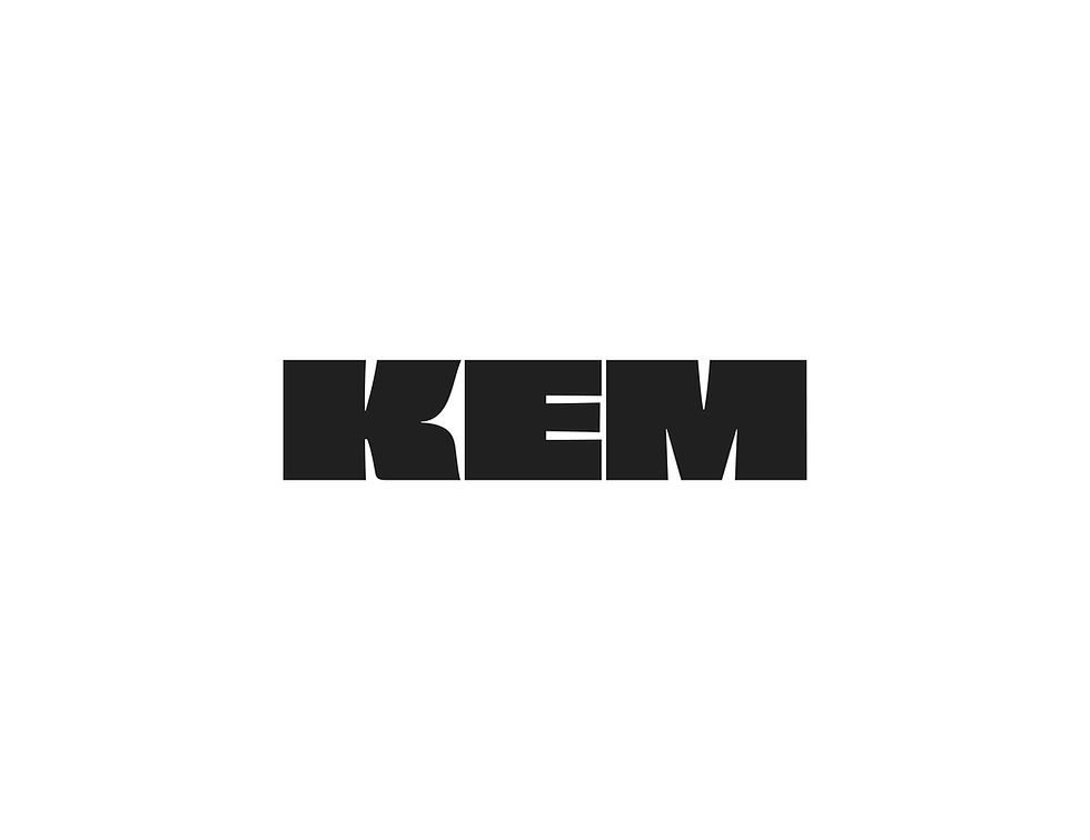
Typography is the silent negotiator of brand trust. In the highly saturated beauty and skincare sector, a brand’s typographic system must do more than simply look elegant — it must immediately communicate market positioning, product efficacy, and institutional authority.
When Atin partnered with independent biotech skincare brand KEM to engineer their complete visual ecosystem, our primary challenge was bridging two historically opposed visual languages: the sterile, rigorous precision of clinical science and the emotive, tactile allure of premium luxury.
We are proud to share that the typographic architecture we developed for KEM has been officially curated and published by Fonts In Use, the premier independent archive of typographic design.
To command category belief, we avoided the soft, ubiquitous serif typefaces that currently dominate the direct-to-consumer beauty market. Instead, we architected a structural, high-contrast typographic system utilising geometric sans-serifs — specifically Futura and Lato.
Futura provides an unapologetic, architectural foundation that signals clinical efficacy and biotech innovation. Paired with Lato for highly legible, secondary product information, the system allows the brand to communicate complex scientific formulations with absolute clarity. When set against generous negative space and a bespoke, high-end colour palette, these utilitarian letterforms are elevated from scientific instruction manuals into a modern luxury vernacular.
A successful brand identity does not just capture attention; it builds perceived value and justifies a premium price point. By meticulously engineering KEM’s typographic hierarchy, we created a visual foundation that scales flawlessly from digital flagship environments to tactile, physical packaging.
Read the full typographic breakdown on Fonts In Use, or explore the complete KEM case study to see how strategic design engineering translates into tangible commercial growth.